Image Optimization: The Oft-Forgotten (But Crucial) Performance Step
- 8 minute read
-


When we think about how to make a Drupal website load faster, we often focus on how to make Drupal render the pages faster: optimizing queries, caching entities, and so on. But out of the box Drupal has several layers of caching enabled by default, and many popular Drupal hosts have additional systems in place like memcached and Varnish to further enhance the overall page load. In practice, the load of the page itself is often a small fraction of the overall time and data needed for a visitor to view a page.
The HTTP Archive recently estimated that nearly 75% of a slow web page’s bloat comes from unoptimized images. With the most recent report indicating that the median page weight is almost 2MB (and many sites substantially higher) that translates into significant opportunities to improve your site’s load times.
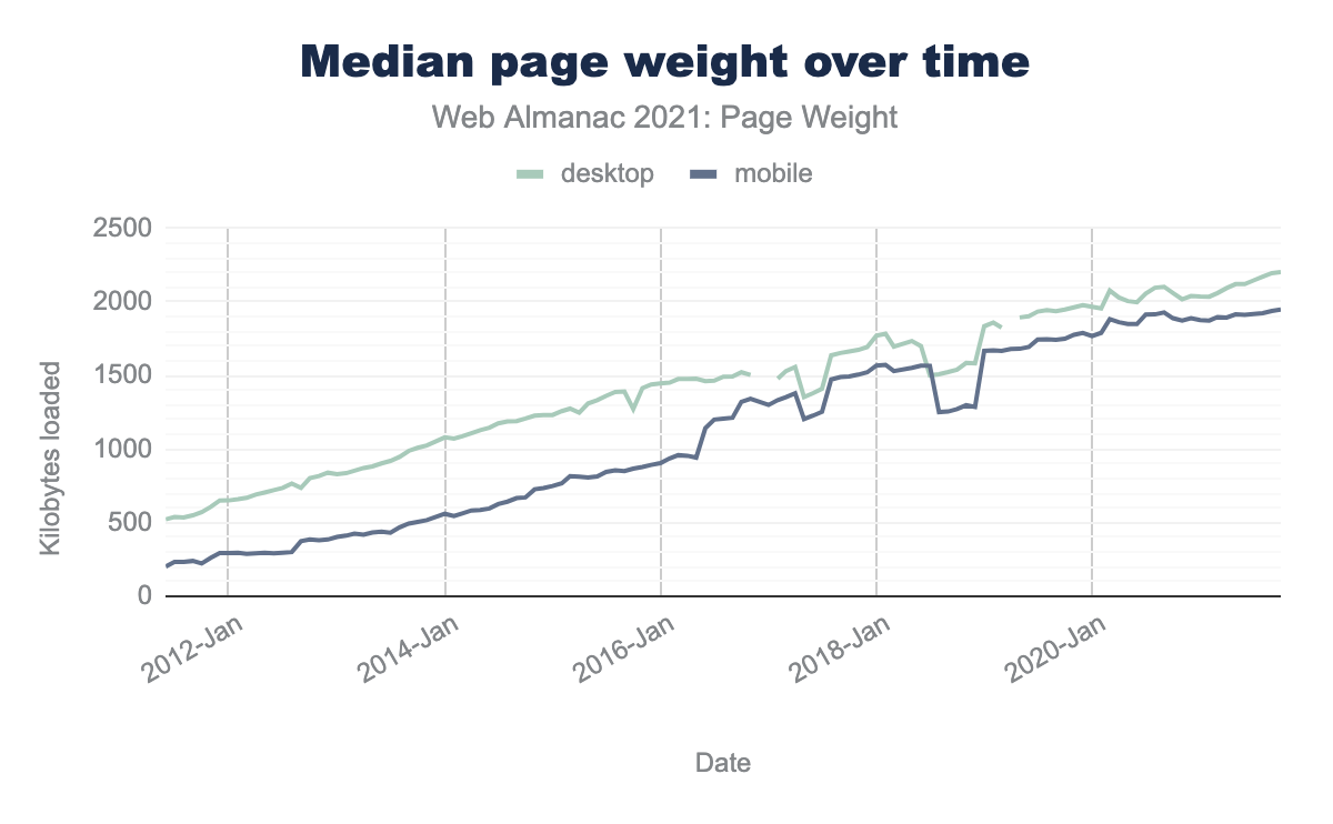
(source: Web Almanac 2021)
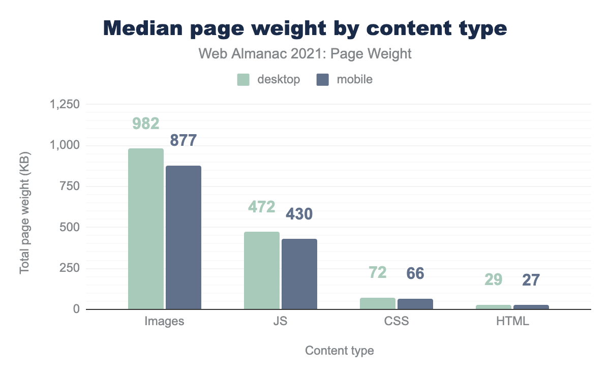
(source: Web Almanac 2021)
Why should you care? For one, slow load times create a bad user experience. That means higher bounce rates, lower conversions, and in general lower success rates for whatever your site is trying to accomplish. Because popular search engines like Google want to provide good UX, they also penalize sites that take too long to load. In 2020 Google incorporated a number of performance-related metrics into Core Web Vitals, a new ranking factor designed to quantify user experience. So not only will a slow site cause visitors to leave, but it will reduce the chances they’ll get there in the first place.
The great news is that Drupal has sophisticated capabilities to automatically optimize your images wherever they’re used on your website.
Image Sizing
A fundamental way to reduce the size of your images is to make sure they’re sized appropriately. Many sites load images that are significantly larger than they’re used on the page, even accounting for higher resolution displays. Fortunately, Drupal has the built-in capability to resize images using image styles, which give your site the ability to automatically generate variations of provided images, resized to whatever dimensions are needed. These variations can either maintain the original aspect ratio, or crop them to a predetermined size. Since automatic cropping can risk cutting out essential parts of an image (e.g. chopping off the head of a person’s profile image), this approach works better when paired with a module that will give authors and editors the ability to provide input on how images should be cropped, such as Focal Point or Image Widget Crop.
But what if you know the images will be shown at different sizes on different devices, because your site is using responsive design? Drupal has a robust, built-in solution for that as well…
Responsive Images
Drupal also comes with a module for creating responsive images, which allows for different, automatically generated image variants to be served based on the screen size of the device a visitor is using. This approach is a great way to ensure your full-width hero image at the top of a page looks gorgeous and detailed on a high-res, ultrawide desktop display, but can also load quickly on mobile devices. The best part is that your content creators only have to upload a single image, and Drupal will do the rest.
Modern Image Formats
Another way to shrink the size of your images is to use more modern image formats, that offer more efficient compression, or an entirely different way of storing an image’s data.
The WebP module allows Drupal to save images that are 25-35% smaller than JPEGs of the same quality. Actually, Drupal has had built-in support for WebP built into core since 9.2, but the module will leverage the <picture> element to also provide a legacy fallback for browsers that don’t yet support the WebP format (currently less than 10%).
WebP is a great solution for continuous-tone images like photographs, but what about line art and illustrations? For icons, logos, and other simple graphics, an ideal solution is the Scalable Vector Graphics (SVG) format, which defines an image in XML as a series of connected points, sometimes grouped into shapes, each of which can have colors or gradients applied, and other CSS styling. That makes the resulting image resolution independent, meaning that you can use it at any size and the image will still look sharp, without needing a larger file. If you want to use SVG images in your site, the SVG Image Field module integrates well with Drupal core, media library, including the ability to have fields accept only SVG images (and not photos) or vice versa.
Optimize Your Images
There are a variety of open source utilities available that can help to further optimize your images, for example by removing unnecessary metadata, or applying other compression methods. The Image Optimize module allows your site to automatically apply relevant utilities whenever an image is processed. It can use the free reSmush.it service for optimizing you images, but if your site is hosted on Acquia, you can also use local copies of the JpegTran and Pngcrush utilities, which will virtually eliminate the latency that can be seen if processing a large image through an external service. Read our image optimization tutorial for a step-by-step explanation of how to make use of these and other capabilities we've included in our platform.
Lazy Loading
Lazy loading is a technique where images (and potentially other content) can be designated to not load automatically as part of the initial page load, and instead will load as they come into view, as a visitor scrolls down the page. This can be particularly effective on large pages with many images, though it can lead to latency for the images as they load, if they haven’t also been optimized with the techniques we’ve already described.

(source: blog.imgix.xom)
The good news is that by default, since version 9.1 Drupal has implemented a property for image tags that will tell browsers to lazy load images. The bad news is that not all browsers have support for this tag (yet, currently around 75%), and you may want to lazy load other content, especially video players loaded through iframes. The Blazy module can help to enforce lazy loading for all browsers, and also for video players.
Other Tools
How can you assess if your site needs more work put into image optimization? Free testing solutions like WebPageTest or PageSpeed Insights or Lighthouse can give you feedback on performance issues related to your images, as well as the Web Core Vitals score for a page.