Next.js Drupal Webform: Easily add webforms to your Next.js site
- 5 minute read
-
Introducing the Next JS Drupal Webform Module
Next.js Drupal Webform is a new library that renders webforms created in the Drupal Webform module in Next.js applications with just a few lines of code for basic use cases. The library is designed to be extendable to support more advanced features in Webform.
Without this library, a Next.js application developer would typically hard code form logic into their application code, which meant developers would need to be involved every time the form needed to be changed. With this new library, forms can be updated without redeployment or any developer intervention.
An example usage of the library in Next.js for Acquia CMS can be found here: https://github.com/acquia/next-acms/tree/main/examples/example-webform
Let’s take a look at some of the capabilities of this new library.
Next Steps in Customization
Without any customization, the Webform component would look like this:
<Webform id={id} data={webform}/>
The example above assumes that some other code has already provided the "id" and "webform" values. A more complete example would look like:
import { DrupalClient } from "next-drupal"
import { components, resolveWebformContent, Webform } from 'nextjs-drupal-webform'

const drupal = new DrupalClient('https://example.com')
const webformId = 'contact_us'
const webformContent = await resolveWebformContent(webformId, drupal)

return <Webform id={webformId} data={webformContent}/>
Build Your Custom Components
The library provides over 40 Webform element components that are commonly used by default.
However, if a user needs a component that is not supported by the library out of the box, or they wish to use their own component, they can pass it to the Webform component.
See example of a custom component here: https://git.drupalcode.org/project/next_webform/-/blob/1.0.x/src/examples/WebformHeight.tsx
<Webform id={id} data={webform} customComponents={{
  webform_height: WebformHeight,
}}/>
Pass in your component(s) to the customComponents property. The key in customComponents is used for resolving the custom Webform element on the correct type. This can be either an override of a type that is supported by default, or a type which is not supported out-of-the-box.
Custom Styling
Users can style their components using the custom components property by passing in the type of webform element they wish to override along with the classes. There could be a number of different approaches in how the components can be styled.
In this example, we are using a React higher order component called withCustomStyles to add Tailwind classes to style the text field element.
const labelProps = {
  className: classNames(['block', 'text-gray-700', 'text-sm', 'font-bold', 'mb-2']),
}

const fieldProps = {
  className: classNames(['form-input', 'shadow', 'appearance-none', 'border', 'rounded', 'w-full', 'py-2', 'px-3', 'text-gray-700', 'leading-tight', 'focus:outline-none', 'focus:shadow-outline']),
};

const wrapperProps = {
  className: classNames(['space-y-3']),
};

    <Webform id={id} data={webform} customComponents={{
textfield: withCustomStyles(components.textfield, fieldProps, labelProps, wrapperProps),
}}/>
A complete example with custom styling can be found here:https://github.com/acquia/next-acms/blob/main/examples/example-webform/pages/index.tsx
Other Capabilities
Conditional Logic
This library supports conditions that are configured in the Webform module. Conditional logic can determine whether or not a field is visible, disabled, etc. on your form based on your configured conditions.
For example, let’s say we have a simple feedback webform where someone can choose their preferred contact method. We add conditional logic in the Webform module to display an email or phone number input field based on the preferred contact method selection.
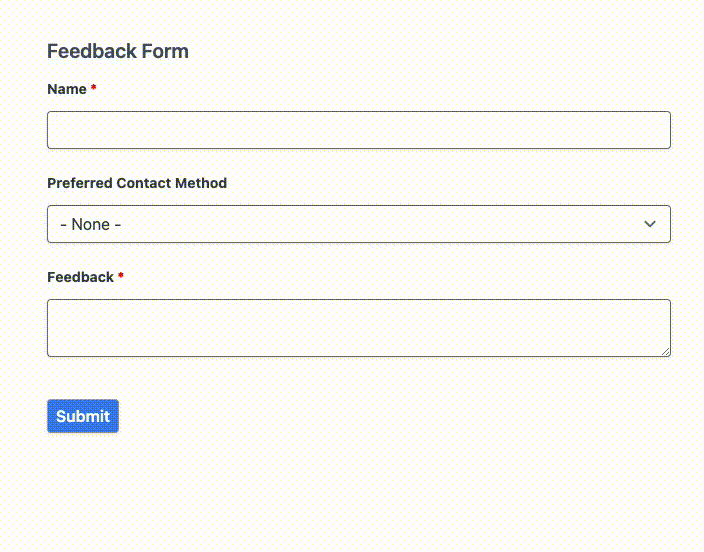
As you can see, the library handles all the condition logic out of the box only making it necessary to configure it in the Webform module.
Validation
All submissions are validated on the server side. In addition, this library currently has frontend validation for email confirmation, date list, and date time.
What's Next
Translations
We plan to add translation support using next-i18next.
Relevant Links
This library is published on Drupal.org and releases are available as an NPM package to add to your project.
Contribute: https://www.drupal.org/project/issues/next_webform
Source code: https://git.drupalcode.org/project/next_webform
NPM package: https://www.npmjs.com/package/nextjs-drupal-webform